Math Experiments
Math Experiments
Across these projects, I treated equations as materials—transforming gradients, 3D fractals, coordinate grids, and oscillations into visible structures. Each experiment demonstrates that simple formulas, when pushed through color or iteration, behave like physical systems and reveal patterns invisible in the raw math.
Why this problem?
A project can be technically strong and still fail if the viewer’s first few seconds are confusing. Polish isn’t decoration; it’s what makes the work accessible. My goal was a version that anyone could navigate without explanation, where curiosity—not instructions—drives the experience. If the graph didn’t make sense immediately, it wasn’t finished.
Problem Statement
Interactive simulations often break or produce misleading data when users push boundaries.
I designed the interface to remain mathematically faithful without sacrificing playfulness. By removing distorting colors and preventing "illegal" interaction states, I created a robust environment where the visual story stays honest—even when inputs are dragged at random.
Collaborating with people (discord)
To stress-test the design, I shared the graph with friends and a few people on Discord and gave them no guidance. Watching them interact showed me where the friction lived—labels that read strangely, variables that weren’t intuitive, spots where they paused or tried something unexpected. Those observations revealed issues I was too close to the project to see.
Reflections
Polishing the simulation forced me to justify every design choice through the lens of the user’s experience. If I couldn’t explain a feature or interaction in a single sentence, it didn’t make the final version. That constraint sharpened the entire presentation and helped me build a simulation that communicates the math cleanly without me standing next to it.
Blackhole Iterations
Step 1 was a sandbox. I wanted a fast way to test curve evolution on a 2D plane inside Desmos, so I wired a first-order ODE 𝑑𝑦/𝑑𝑥=𝑓(𝑥,𝑦) to a classic Runge–Kutta (RK4) loop and sprayed trajectories from randomized starting points. The goal wasn’t physical accuracy; it was to validate the numerics, step-size behavior, and visualization pattern I’d later reuse for real geodesics. Once this was stable and predictable, I had the scaffold to build the rest.
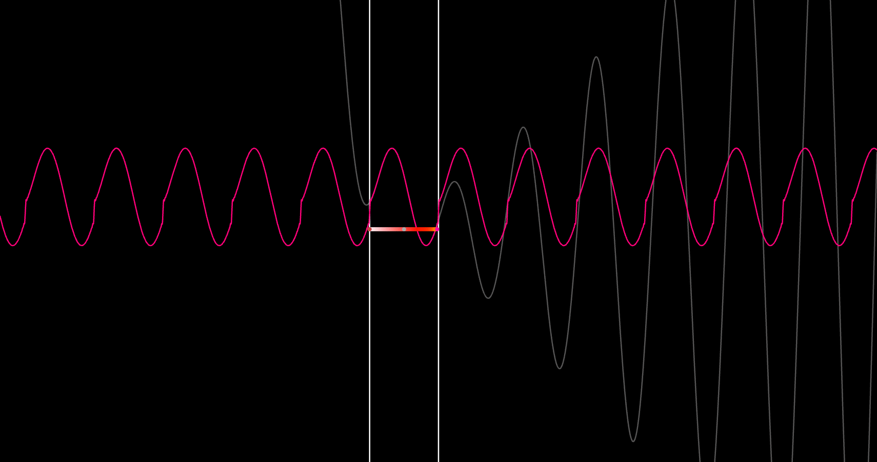
Wave Color Generator
Wave Color started as a challenge from my dad, who was working on an AI music creator at Google and wondered if there was a way to take any sound wave and separate the parts that make it up, then color those parts so different elements—like guitar and piano—could be seen instead of just heard. I built a system that takes an arbitrary sound, breaks it into its smaller waves, and assigns each one a consistent color based on its physical characteristics, so patterns that are normally invisible become easy to recognize. Instead of trying to identify instruments, the project focuses on making the structure of sound visible, revealing how different tones layer, interact, and shape the overall signal. It became an experiment in translating audio into a visual language, showing how color and physics can work together to make complex signals intuitive to understand.
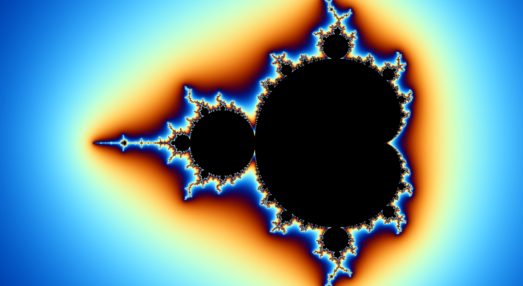
Mandelbrot Set
This graph is the classic 2D Mandelbrot set, but rendered through Desmos’s beta 3D engine like it’s a volumetric object. Each point in the plane is iterated under the usual Mandelbrot formula, and instead of just labeling points as “inside” or “outside,” the graph tracks how fast they escape and uses that as both a depth cue and a color source. The color comes from a smooth sine based palette adapted from a Shadertoy shader, which turns tiny differences in escape behavior into soft gradients and bands instead of harsh rings. Technically the object is just a flat slice in 3D, but the fake depth and the slider that moves the sampling layer make it feel like you’re flying a camera through a thin fractal fog, revealing different layers of structure in a set that’s usually shown as a flat image.

Normal Coloring
This graph was a quick experiment in treating a simple animated surface the way a game engine treats a 3D object—with its color driven by the direction the surface is facing rather than by its height. I built a smooth radial wave that expands and contracts over time, then asked Desmos for its local slope in different directions. Those slopes became the inputs for several color styles, so the picture shifts not just because the wave moves, but because its “orientation” changes. I also layered in a lightweight noise pattern to see how the coloring reacted when the surface wasn’t perfectly smooth. The whole thing became a small testbed for understanding how normal maps work and how much structure you can pull out of nothing more than the shape of a surface.
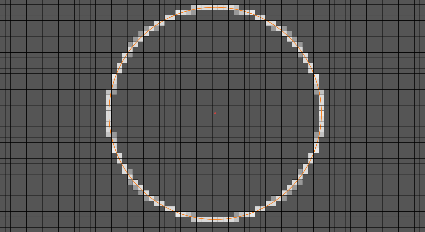
Parametric Pixilizer
This setup acts as a miniature block-engine inside Desmos, built for experimenting with how shapes would look in something like Minecraft. Instead of drawing a smooth circle, the system samples its outline and converts every point into a specific block position on a square grid, lighting up those blocks one by one. The result is a clean “voxel-style” version of the circle, showing how a curved shape gets translated into a pattern of discrete squares—basically the 2D version of placing blocks to approximate a round structure. It works like a blueprint generator: feed in a smooth shape, and the graph shows the exact block coordinates needed to build it in a block-based world. This makes it a useful tool for visualizing how continuous geometry becomes grid-friendly, and for designing pixel- or voxel-style structures before building them in a game.